Table of Contents
Introduction
In this chapter you will be introduced to the basic operating concepts of the foreknown app. You will notice that the way of operating and the offered functions are repeated uniformly across all dialogs, so that an intuitive operation of foreknown can be reached very quickly.
Technical Base
Responsive Interface
The entire interface of foreknown has been implemented in a responsive manner. This means that the display of the user interface automatically adapts to the device used and the size of the browser window. In this way, all dialogs and their controls can be displayed and used reasonably on a cell phone, a tablet or a desktop PC.
Progressive Web App (PWA)
To make foreknown even more usable from mobile devices, we have developed our app as a so-called "Progressive Web App (PWA)".
What does this mean?
A Progressive Web App (PWA) is a website programmed in a very specific way, which can offer certain features that normal websites cannot:
- They can be installed on smartphone, tablet or desktop.
- They load significantly faster than normal websites
- They work offline as needed
This way you can install foreknown like an app on your cell phone or tablet and access important functions and data of foreknown quickly and easily at any time, even on the go.
Installation on Android
When you open the foreknown app in the Chrome browser on an Android phone / tablet, the browser offers the option to install this web application as an app.
Note: A detailed description for the installation will be provided later.
Installation on iOS
Even though not all functionalities of a PWA can currently be used under Apple's iOS operating system, it is still possible to add the foreknown app as an icon on the home screen.
Following steps are necessary:
- Open the foreknown app in Safari browser with the URL "https://<app|subdomain>.foreknown.io/en". It is important to specify the language as well, since a later change in the app will lead to a misbehavior. As soon as /en is supported, you can of course choose English here.
- Select the "Share" button in the Safari browser.
- Select "Go to home screen" from the list of options offered.
That's it. There should now be an icon on the home screen that opens the foreknown app, without the surrounding browser window.
General Concepts
The following describes the basic operating elements of the foreknown user interface, which are thus applied uniformly in all dialogs.
Navigation
Navigating to the individual areas of the foreknown app is essentially done via the main menu located on the left.
The main menu contains the following components:
- Home Page Link: The foreknown app logo provides a link to the home page of the app, so you can always get to the home page from any page.
- Burger Menu: To the left of the foreknown App logo is the "Burger Menu" button. This offers different options depending
on the end device:
- Mobile Devices: The main menu is hidden by default on mobile devices. By clicking on the Burger Menu button, the main menu is displayed and the desired page can be selected. Afterwards the main menu closes again.
- Desktop devices: The main menu is shown by default if the browser window is large enough. Clicking on the Burger Menu button will hide the navigation, leaving more space for displaying the current page. If the browser window is too small, the same behavior is automatically offered as for mobile devices.
- Menu Group: The main menu is divided into several menu groups to divide the app into meaningful functional areas. When starting the foreknown app, all menu groups are closed. Selecting a page from the main menu keeps the associated menu group open and the selected menu item in bold.
- Menu Items: Each menu group contains one or more menu items that, when selected, open the associated dialog. The selected menu item is then displayed in bold.
Once a page is selected from the main menu, there are always three links in the upper right corner below the profile picture.
- Back: A click on this link always leads to the previously displayed page, thus corresponds to a browser "Back" button.
- Help: The help link opens in a new browser window the help page associated with the current page.
- Refresh: Is displayed as an "arrow in a circle" icon and refreshes the current page.
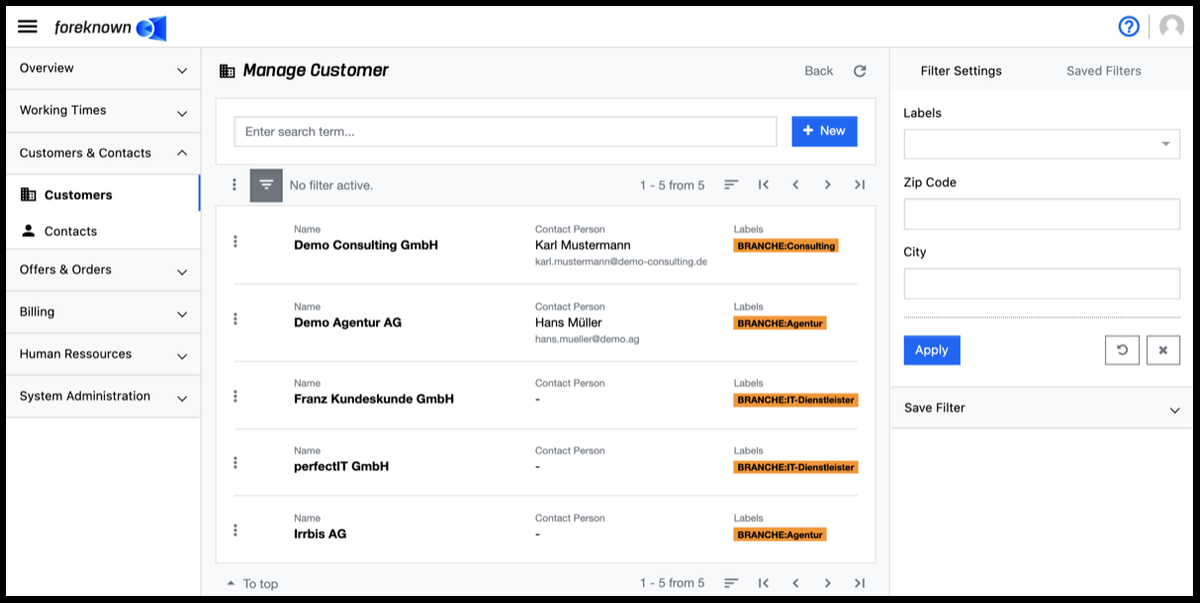
List View
For the management of certain business objects, such as customers, contacts, offers, invoices, etc., a list of all business objects is usually offered as an initial dialog, through which one can search, filter, select and perform actions.
In foreknown, these types of lists are usually structured in the same way and always offer the basic functions in the same way. In the following, a list of services is used as an example to explain these functions.
The following actions are offered on the left side of the list:
- Action Menu (List): Opens a drop-down menu with all actions that can be performed on all or selected entries.
- List Selection Menu: Opens a drop-down menu to select or deselect all entries of the page / list. Not available in all lists.
- Show/Hide Details: Action that shows/hides additional information per entry. Not available in all lists.
- Show/Hide Filter: Action that shows/hides the filter dialog on the right side of the dialog. Not available in all lists.
- Filter Status: Indicates whether one or more filters have already been set for the current list.
- Action Menu (Entry): Opens a drop-down menu with all actions that can be performed on the individual entry.
- Select/Deselect Entry: Allows individual entries to be selected for overall actions. Not available in all lists.
The following actions are offered on the right side above and below the list:
- Hit Display: Displays the currently displayed and total hit sets and provides a drop-down to select the number of hits per page.
- Sorting: Displays all the properties in a drop-down by which the list can be sorted in ascending and descending order.
- Scroll function: Provides all actions to scroll through the list page by page or jump directly to the beginning or end.
Intelligent Input Fields
When creating new business objects such as offers, orders, invoices, it is important for efficient work that all necessary data can be entered at the same time. For example, if a new offer is to be created but the customer has not yet been created, the offer entry should not have to be aborted when the customer is selected.
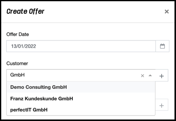
In order to be able to handle the entry of the customer directly at this point, the "Intelligent input fields" are offered. These have different options, e.g. to assign a customer to an offer.
- as soon as the input field gets the focus, a list of the last seized customers opens. If the desired customer is there, this can be selected directly.
- as soon as one begins with the input of the customer name in the field, below the field in a list all customers are indicated, who contain the entered text in the name. If the desired customer is displayed, it can be selected.
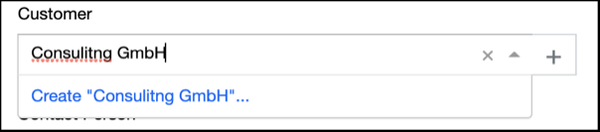
- If the customer does not exist yet, it can be created and assigned either via a link in the list "Create "test customer"..." or via the button with the plus sign directly in a popup dialog.
This way you do not have to leave the current process and you can quickly create the offer. You can find these smart input fields in many create and edit dialogs of the foreknown app.
Filter
foreknown offers, in dialogs where entries e.g. offers, orders, invoices are listed, the option to use a filter to reduce the list to a desired set of entries. The filter dialog is always located on the right side and can be shown or hidden by clicking on the button with three dashes located above the list on the left side.
A filter dialog always consists of two tabs, which are described in more detail below.
Tab: Filter Settings
Depending on the type of entries, different filter options are offered. Multiple selection is also possible in some cases.
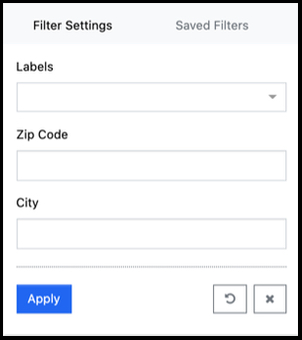
In this filter dialog, for example, multiple labels can be selected. In the case of a multiple selection, an "OR" link is always applied. So entries will be found which contain either label A or label B.
The "Apply" action displays all entries in the list that match the filter criteria. With the action "x" all filter settings are removed and the list shows all entries again. The "Reset" action (symbol: arrow in circle) discards all changes that may have been made to a saved filter.
Tab: Saved Filters
If you want to use the currently selected filter criteria more often, you can save them as a "Saved Filter". To do this, open the "Save Filter" section, assign a unique name and description, and specify whether the filter should be reusable only for your own use (Private) or for all users (Public).
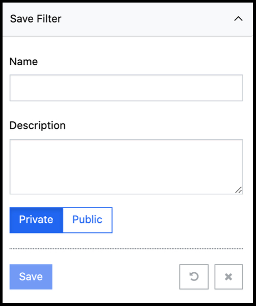
If the filter has already been saved before, the "Overwrite filter" option can be used to change and overwrite the existing filter. However, this option is only offered if you are also the creator of this saved filter. The "Save" action saves the current settings.
The "Saved Filters" tab allows you to access the filters that have already been saved.
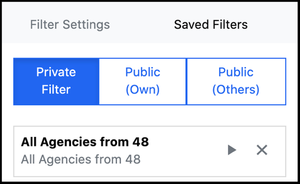
A distinction is made between three filter categories:
- Private Filters: All filters created by the current user and marked as "Private".
- Public ( Mine): All filters that have been created by the current user and marked as "Public".
- Public (Other): All filters created by other users and marked as "Public".
By selecting one of the above categories, the corresponding saved filters are listed. Clicking on the play icon executes the filter and takes you back to the "Filter Settings" tab, where the filter criteria are displayed and can also be changed and saved again if necessary.
Public filters of other users can be saved and adjusted as own, private filters at any time.
Notes
Notes can be noted on various business objects, such as customers, contacts, offers, orders and invoices, e.g. from communication via telephone or e-mails, in order to document important information chronologically. These are always located in the detail view under the "Notes" tab.
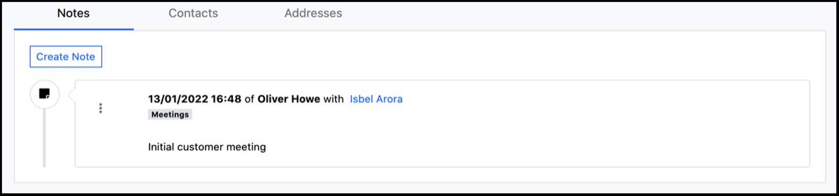
All notes are displayed with the selected date, the name of the creator, the assigned labels and with the text in chronological descending order. The following actions are available per note via the action menu.
In front of each note there is the action menu (button with 3 dots), which allows editing and deleting notes.
Create Notes
The "Create Note" action button opens the dialog of the same name.
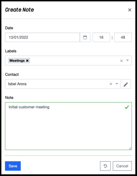
This dialog allows you to enter the following properties:
- Date: With the date and a time you define the exact time for a note.
- Labels: Additional labels can be used to categorize a note so that, for example, it is quickly recognized whether it is information from a telephone call, meeting or e-mail.
- Contact: This option is only available in a note for customers and allows the assignment of the customer contact with whom, for example, a phone call was made.
- Note: This field is used to enter the note. Markdown notation can be used to allow easy formatting of the text.
The "Save" action saves the new note. With the action "Reset" and "Cancel" the entries are discarded and in case of the action "Cancel" the dialog is closed.
Edit Notes
Clicking on the "Pencil" icon will open the "Edit Note" popup dialog.
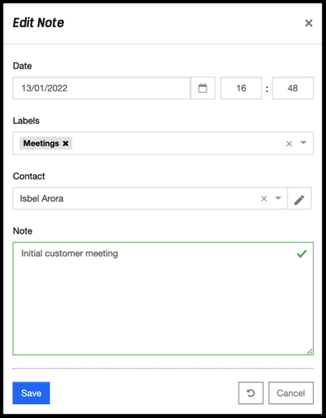
The following properties can be changed:
- Date: The creation date can be changed including the time.
- Contact: In case of a customer note, the contact person can also be changed.
- Labels: The labels of the note can be changed.
- Note: The text of the note can be changed.
With the action "Save" the changes to the note are saved. With the action "Reset" and "Cancel" the entries are discarded and in case of the action "Cancel" the dialog is closed.
A note can be deleted by clicking on the "X" symbol. A confirmation dialog opens where the deletion must be confirmed again.
Edit Note Labels
Clicking on the "Labels" icon will open the "Change Labels" popup dialog.
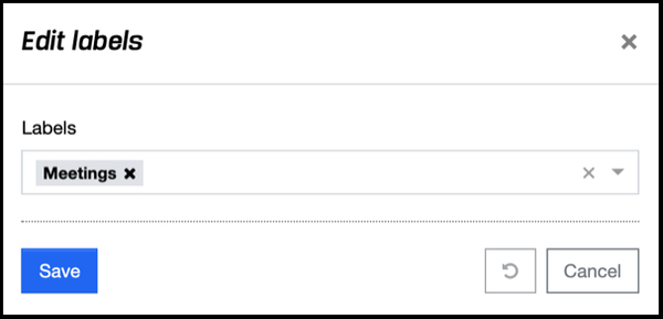
Via the input field assigned labels can be removed, existing labels can be selected or new labels can be created directly during assignment.
The "Save" action saves the changes to the note. The "Reset" and "Cancel" actions discard the entries, and in the case of the "Cancel" action, the dialog is closed.
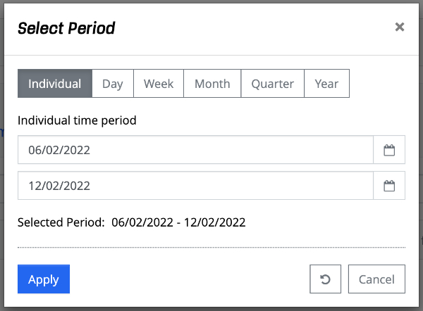
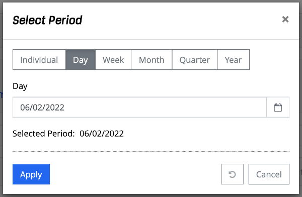
Select Period
In various areas of foreknown, especially in filters, the "Select period" dialog is used in order to be able to to easily select different time periods.
Individual Period
A start and end date can be selected via a calendar.
Day
A single day can be selected via a calendar.
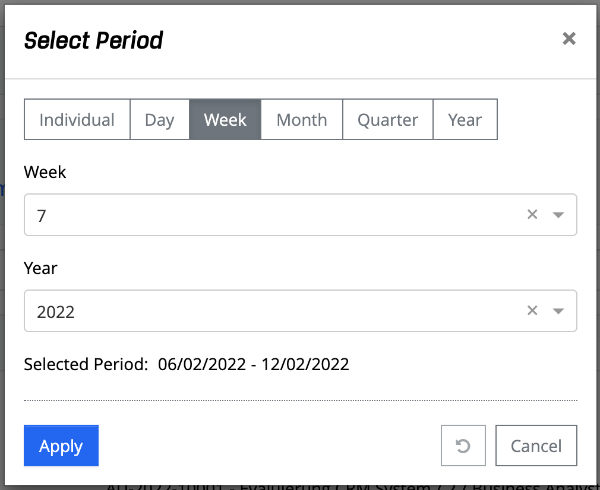
Week
A week and a year can be selected via a drop-down field.
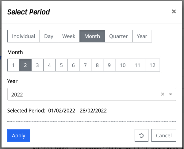
Month
A month can be selected via 12 buttons and a year via a drop-down field.
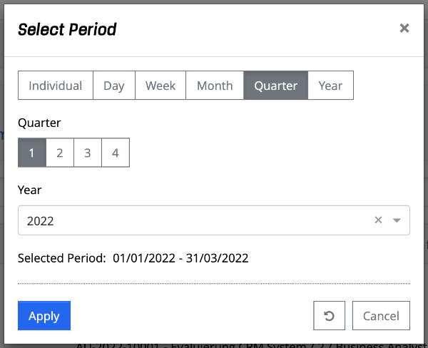
Quarter
A quarter can be selected via 4 buttons and a year via a drop-down field.
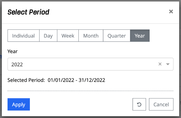
Year
A year can be selected via a drop-down field.
Via the "Apply" action, the period is transferred to a filter, for example. The action "Reset" (circular arrow) resets the dialog to its initial state. The action "Cancel" closes the dialog without applying the period. the time period.